IOS 14
- Andrea Grbić
- Sep 26, 2020
- 3 min read
I was so excited for the iPhone update and for the ability to customize my home screen! As you all know I love things organized and neutral.
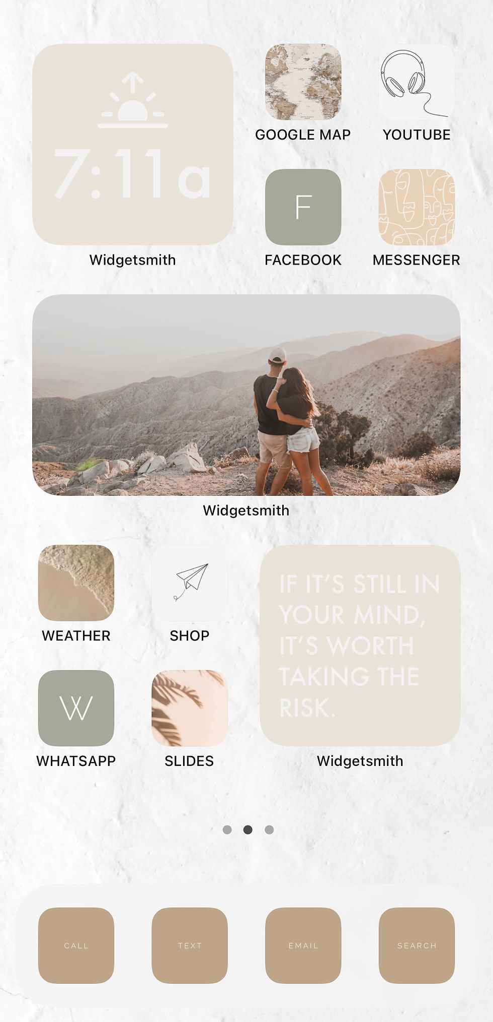
Here is how mine turned out! Note: I am not a techie so if I figured it out you can too!


1. First thing I did was change my wallpaper so that when I add all my widgets and icons it looks more clean. I didn't want just plain white so I picked a white with some texture.
[you can screenshot mine below]

2. I then changed the shortcut icon for my main menu [Call, Text, Email + Search (Safari)] Click here to learn how!
[screenshot mine below] - I personally made these with the colour I desired.
3. I downloaded the widget smith app and then browsed which ones I wanted considering possible layouts. I picked the cream colour, futura font, and the tint colour white. For the widgets on my main page I did a medium sized 'Upcoming Event', a small sized 'Clock' and a 'Photo'. On the 2nd page I did a small sized 'Sun Down' so that I know when Sabbath starts/ends and to know when golden hour is! I also added a small sized 'Text' widget where I can just add a quote I find inspiring and change it up every so often.
To add this to your homepage tap and hold down until your apps wiggle > Click the '+' in the top left corner of the screen > Scroll all the way down to "Widgetsmith" > Add Widgetsmith at the bottom. Hold down the widget and click "edit widget" to change it to your desired one.
4. The next step is to decide on which apps you use the most and what icon you would like to showcase it. Keep your theme consistent so that your apps and widgets compliment each other and everything looks aesthetically pleasing. I went with all neutrals (surprise surprise :P ).
[screenshot mine below] - Found on Pinterest
5. Add some photos/prints to some apps to add interest.
[screenshot mine below] - Found on Pinterest
6. Add some personal photos as Icons (while still keeping your theme in mind).
7. With the basic apps I just made some simple icons with a complimenting colour.
[screenshot mine below] - Instagram, Facebook, WhatsApp.
8. Lastly play around with the layout! Move around your apps to what makes sense to you and try to group them in categories as well. You can change the widgetsmith sizes in order to make a layout you're satisfied with.
There are things to consider... Creating shortcuts doesn't give you notification bubbles as the native app does and the apps will take a moment longer to open since it'll open the shortcut app first, then redirect you to the app you clicked. If you want the transition between the shortcut app and the app you're opening to go faster go to settings > accessibility > motion > reduce motion. I moved all the original apps to the last page into folders (like before) : Social, Work, Health, Editing Tools, Basic, Utilities, Home Screen + Extra in order to still see the notifications.
Seeing as that customizing iPhones has become so popular I am sure Apple will work on how to make this more efficient (not having to use the shortcut app) but I just love the aesthetics of my phone now and finally being able to do some customization is worth going a little cross-eyed:P
Please tag me @andreagrbic_ if you found this helpful! And please share your results, would love to see what you have created!


Comentarios